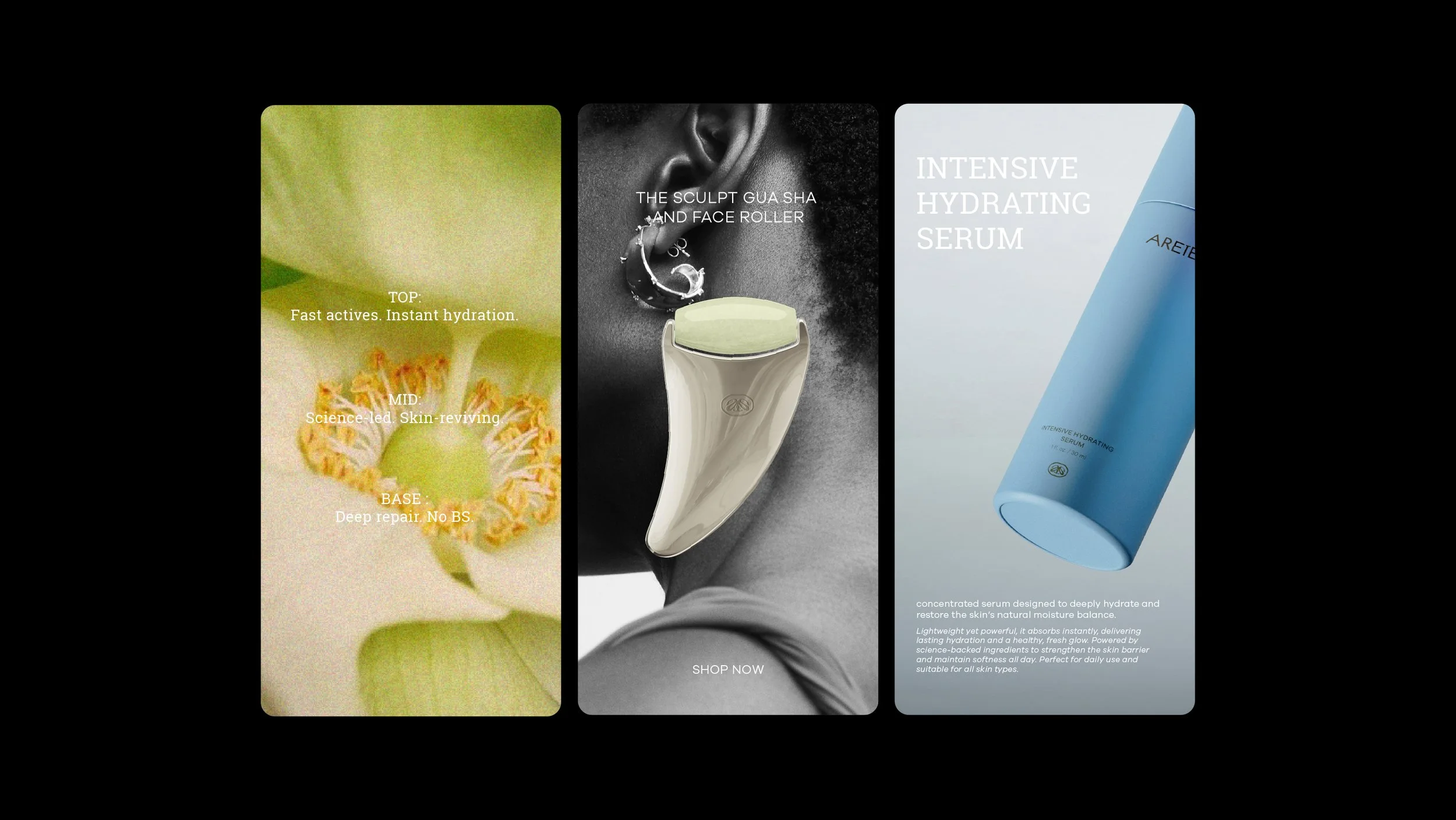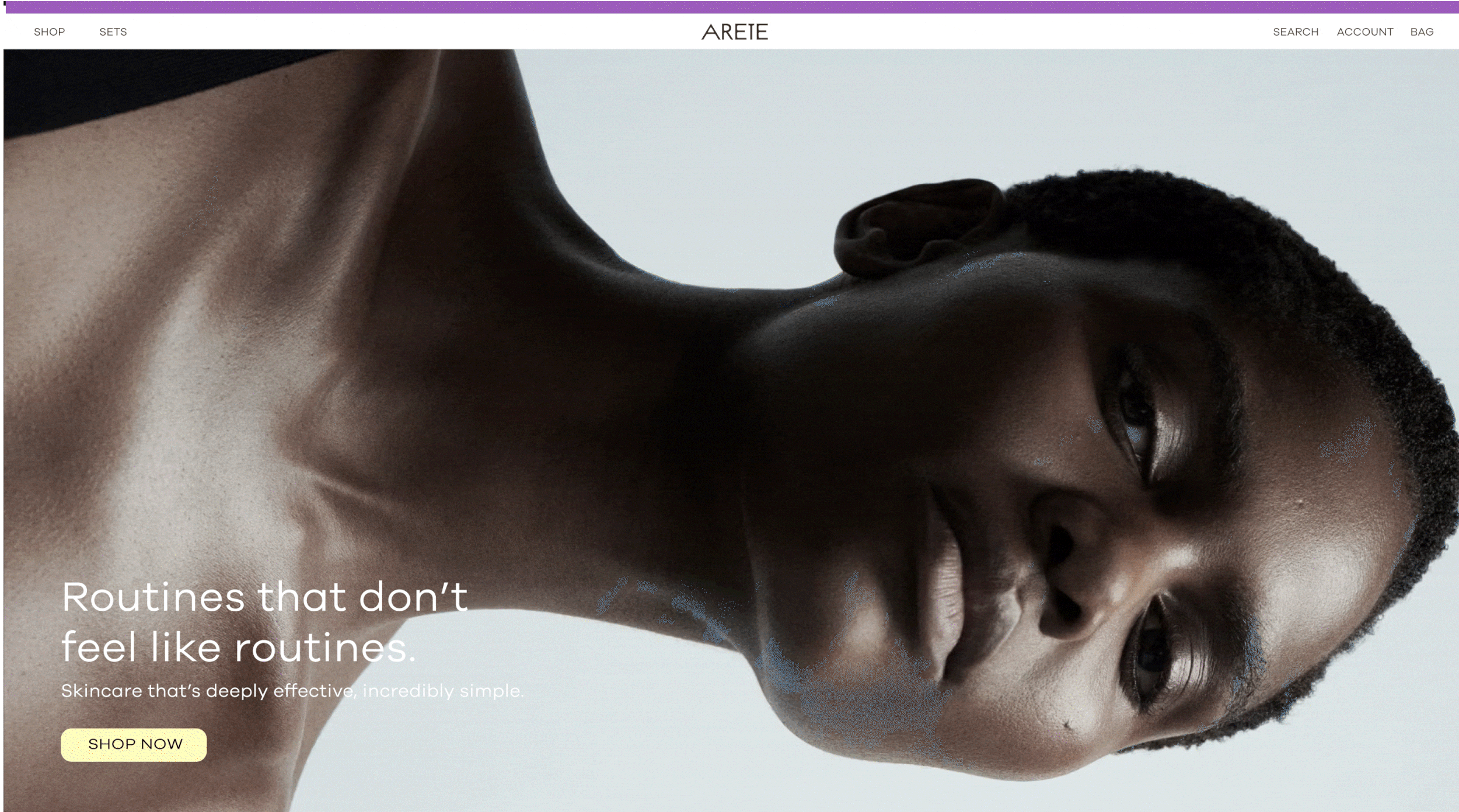
ARETE — Skincare Without Compromise
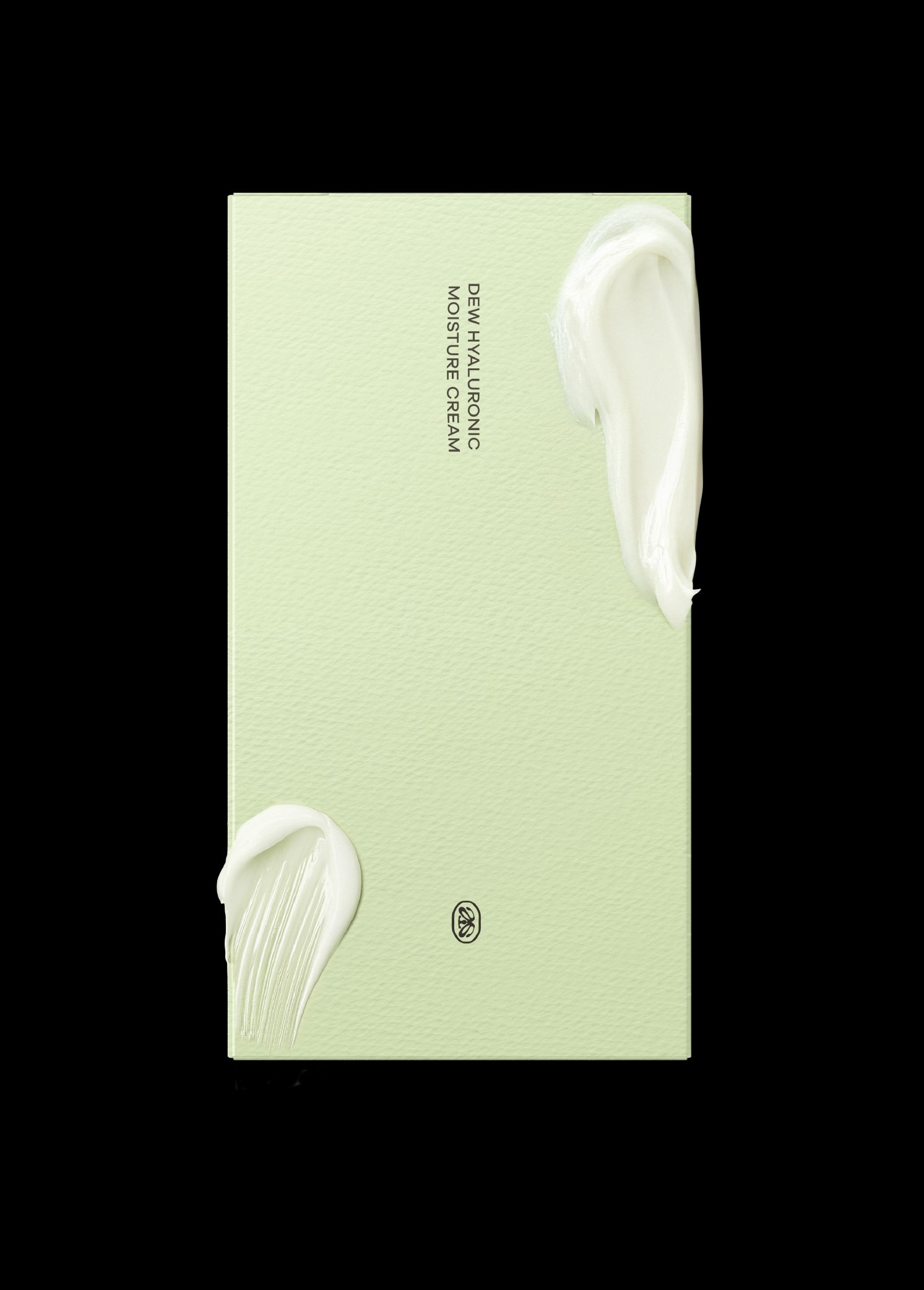
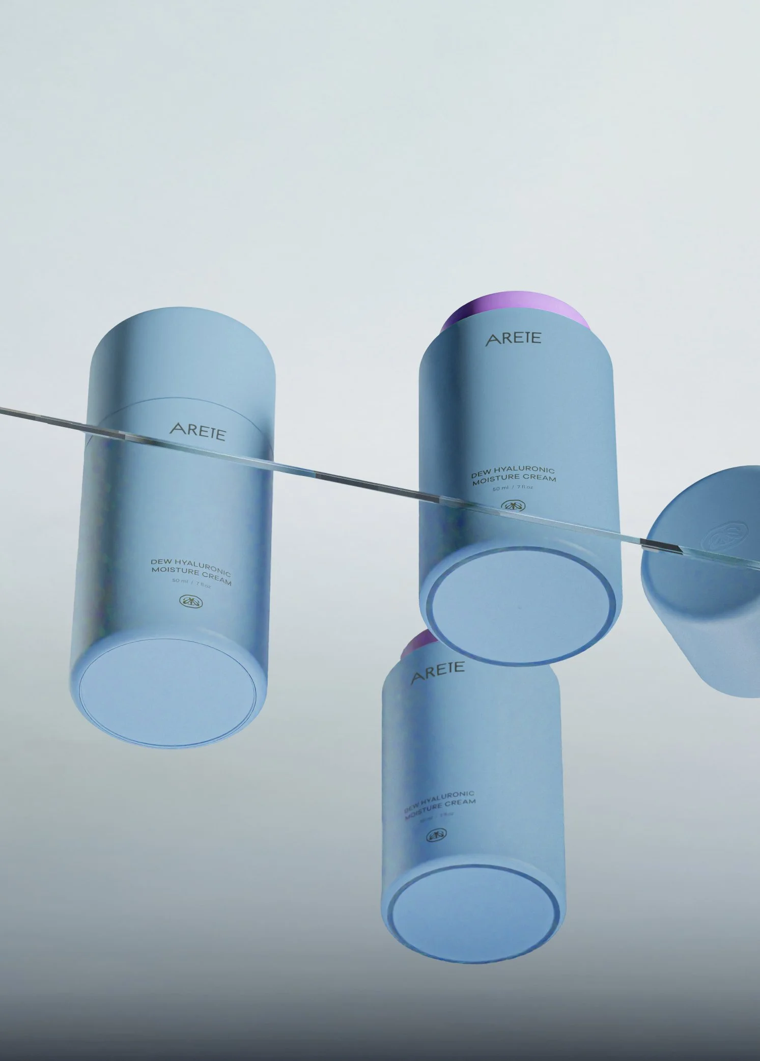
ARETE is a skincare brand crafted around a single philosophy: gentle care with uncompromising performance. The identity reflects this through minimal, clean visuals, calming color palettes, and tactile packaging that embodies both purity and efficacy. Every design choice — from the custom logotype to the symbolic mark — reinforces the idea that true beauty starts with thoughtful care and honest results.
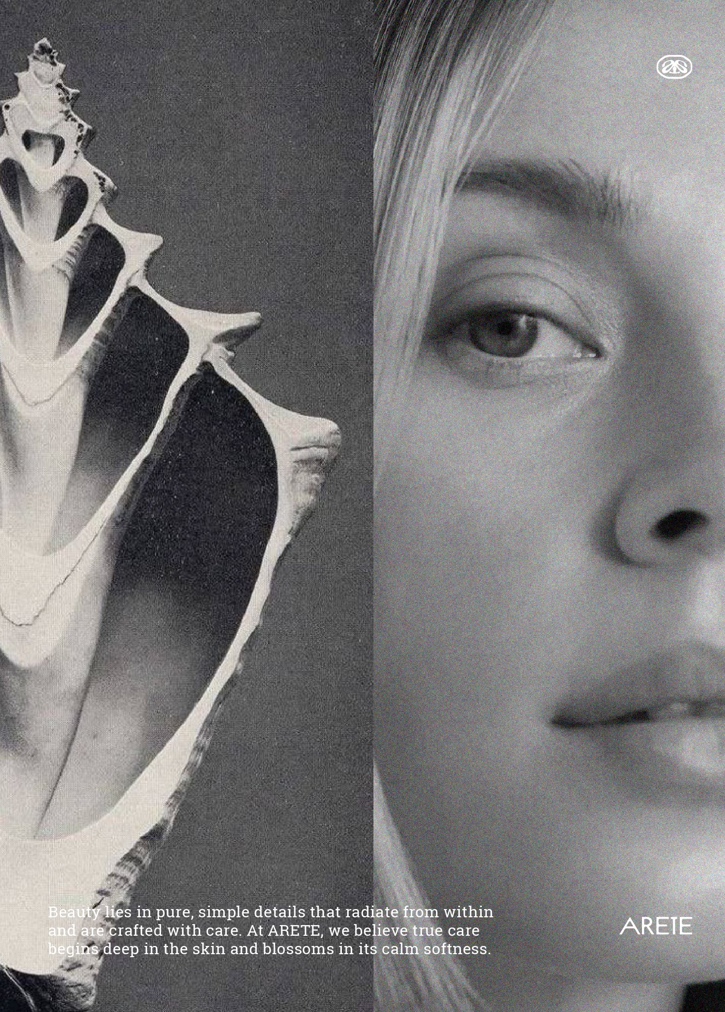
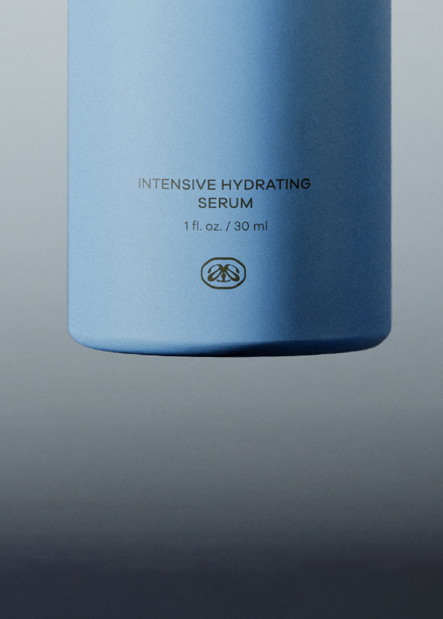
The brand’s symbol, inspired by organic, flowing forms, mirrors the softness and fluidity of healthy skin. The typography is understated yet confident, letting the product and its integrity speak louder than any trend.
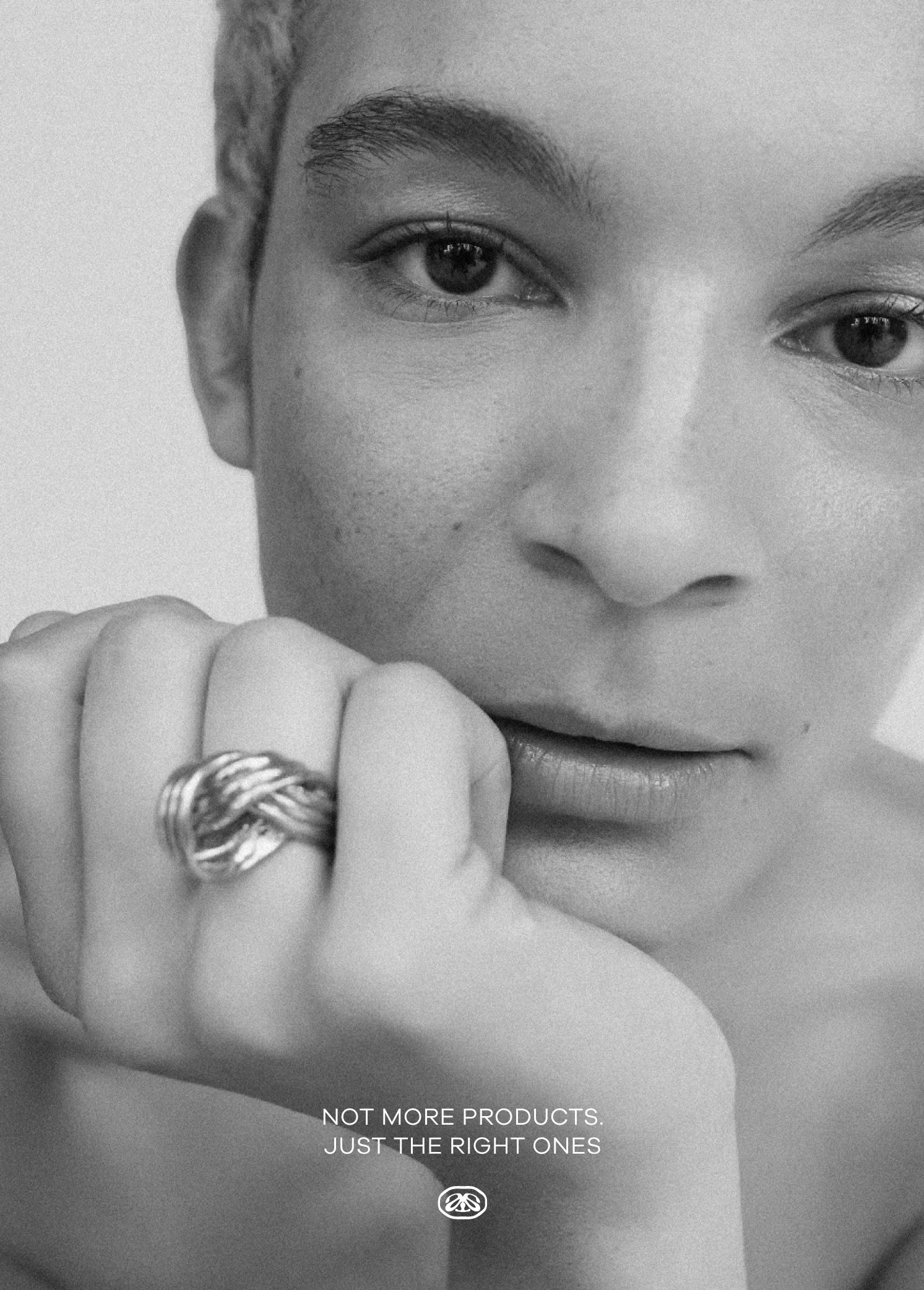
This project is close to my heart, created for my sister and built with an obsessive attention to detail to represent her dedication to clean, science-backed skincare. It’s an exploration of balance: modern yet warm, clinical yet human.